The world of web browsing is constantly changing and evolving, and it can be difficult to keep up with all the latest trends. One of the most popular browsers on the market today is Safari for Mac, and it has a useful feature that allows you to view websites in mobile view. With this feature, you can quickly and easily switch between the desktop and mobile versions of a website to better suit your needs.
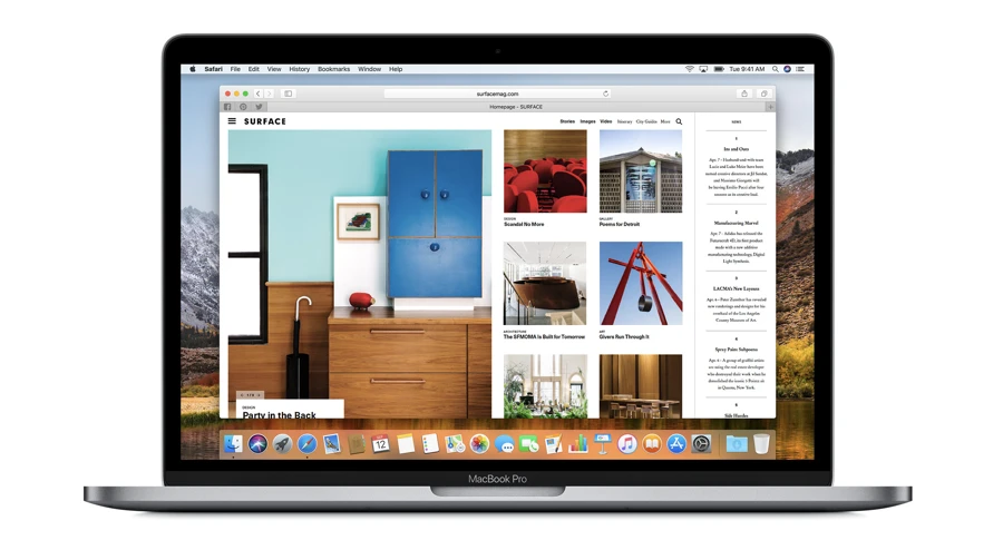
Let’s take a look at how Safari for Mac’s mobile view works. When you open Safari, you’ll notice that there is an icon with two arrows pointing in opposite directions in the top left corner of your browser window. This icon indicates that you can switch between desktop and mobile views at any time.
When you click on this icon, a menu will appear with several different options. The first option is “Show Mobile Website,” which will switch your current page to its mobile version if it is available. The second option is “Request Mobile Website,” which will ask the website to display its mobile version if it does not already have one set up.
In addition to being able to switch between desktop and mobile views within Safari, you can also use the browser’s Responsive Design Mode (RDM) tool to preview how a website will look on different devices. To access RDM, click on the Develop menu at the top of your screen and select Enter Responsive Design Mode from the drop-down menu. Once enabled, RDM will automatically adjust your browser window size so that it simulates different devices such as tablets or phones.
Overall, Safari’s mobile view feature makes it easy for users to quickly switch between desktop and mobile views while browsing the web, allowing them to enjoy a more optimized experience no matter what device they are using. Whether you’re looking for a way to preview how your website looks on different devices or just need an easy way to access its mobile version when needed, Safari for Mac’s mobile view feature has got you covered!

Opening Mobile View in Safari on Mac
To open mobile view in Safari Mac, you will need to enable the Responsive Design Mode in Safari DevTools. To do this, launch Safari and click on ‘Safari’ from the top menu bar. Select ‘Preferences’, then ‘Advanced’ from the drop-down menu. Make sure that the checkbox for ‘Show Develop menu in menu bar’ is selected, then close the preferences window. Now, with the Develop menu visible, select ‘Enter Responsive Design Mode’ from the list of options. This will open a new window with several device options available for testing your website’s responsiveness on different mobile devices. Select one of these devices to test your website in mobile view.
Changing Safari to Mobile Mode
To switch Safari to mobile mode, start by tapping the? An icon to the left corner of the Safari address bar. On the menu that shows up, tap Show Mobile Website. This will change the view in Safari to a version that is optimized for viewing on mobile devices such as smartphones and tablets. The website may look different than its desktop view, but it should provide you with a better experience on your device.
Testing Mobile View in Safari
To test the mobile view in Safari, first, open the browser and navigate to the desired URL. Then click on the Develop menu in the top navigation bar and select Enter Responsive Design Mode. This will open a new window that will allow you to select the desired device. You can choose from a variety of different devices such as iPhones, iPads, Android phones, and tablets. Once you have selected your desired device, the target URL will be displayed on that device’s screen size and orientation. This allows you to quickly test how your website looks on different devices without actually having to use those devices physically.
Conclusion
In conclusion, Safari’s mobile view feature is a great way to quickly and easily browse the web from your Mac computer. It allows you to switch between the desktop and mobile versions of any website, giving you the flexibility to access content on the go. Additionally, Safari’s Responsive Design Mode provides an easy way to view websites in different screen sizes and resolutions, allowing you to get a better understanding of how your designs will look on various devices. With Safari’s mobile view feature, you can be sure that your web pages are optimized for viewing on any device.


